
For dealers
- Greater independence
- Faster ordering
- Better visibility over their business
Turning fragmented, support-assisted ordering habit into fast, scalable, self-confident digital workflow — for the 80,000+ dealers who run their business on MyAwaaz.
Owned the journey end-to-end.
Research synthesis Problem framing Solution direction Wireframes UI design Validation Developer handoff
MyAwaaz is a dedicated business platform built for Asian Paints dealers — a centralized place to manage their orders, sales and inventory. Online ordering sits at the centre of the experience, yet it still hadn't become the dealer's default way to work.

This project sat within the larger MyAwaaz revamp, aimed at reducing dealer dependence on physical support channels and growing online ordering by both value and volume.
Online ordering was a critical workflow because it sat at the center of dealer adoption, revenue, and operational efficiency.
However, the existing ordering journey had not become the dealer's default workflow.
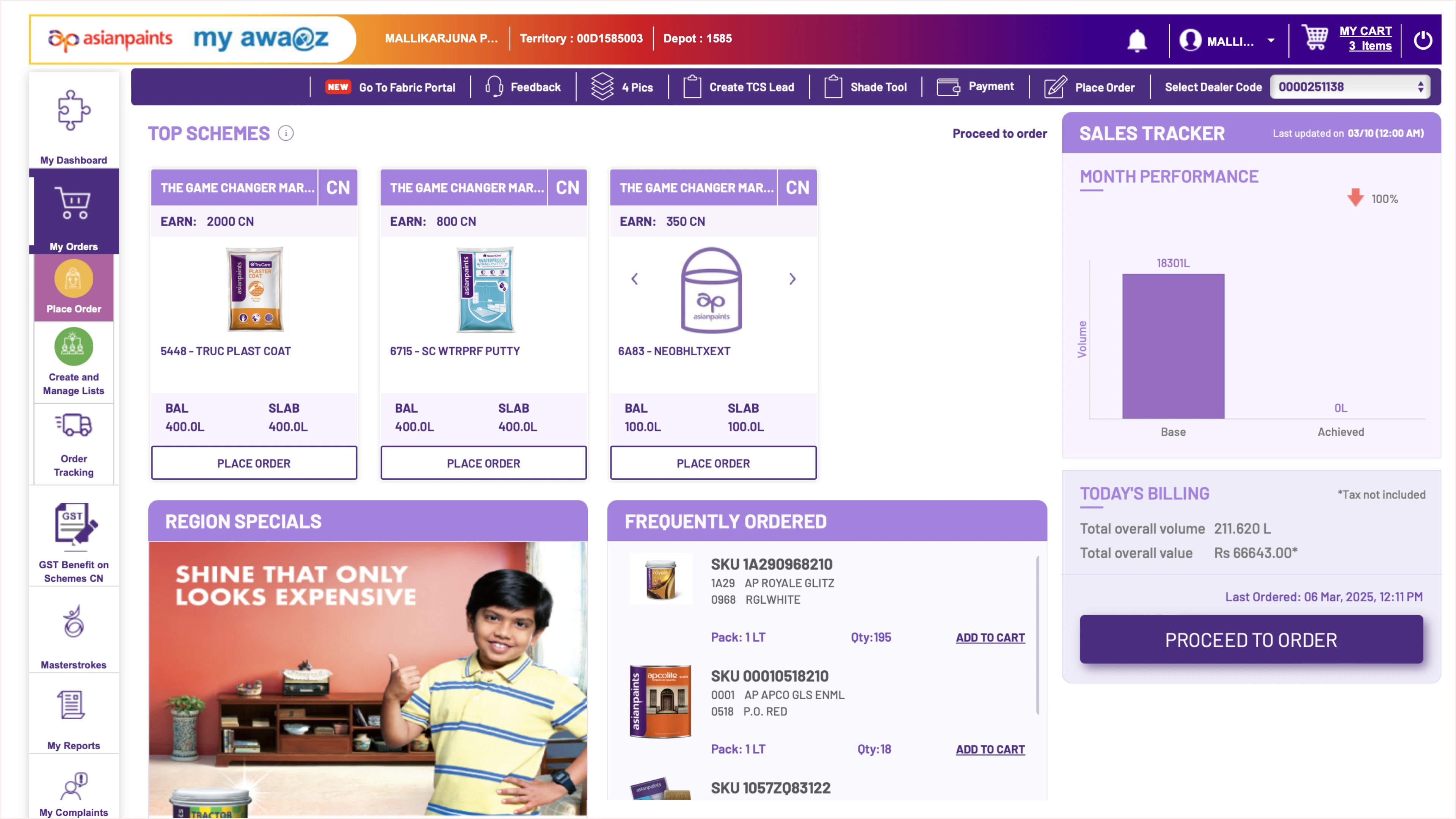
The same loop, every order — until the dealer abandoned the portal and reached for the phone. That abandonment was the habit the revamp had to break.— Primary source: Heat maps & Fallout charts from Adobe Analytics
 1
1A dealer opens the portal to place a routine order.
 2
2Looks around, adds to cart, repeats same act for multiple items.
 3
3Stops engaging/interacting. Cursor wanders away from "Checkout".
 4
4Abandons cart. They are placing orders offline over call.

Often called TSEs for routine order placement.

Relied on Awaaz helpline, often with waiting time and low visibility.

Became the last resort.
Ordering through the portal felt slower than support channels.


32K+ complaints and sub-3★ ratings collected over the past 5 years, through quarterly TSE-driven holistic dealer surveys. Ordering was one of the largest sources of pain.
A walkthrough of the legacy ordering screens — the heuristic issues that kept dealers off the portal, pinned to where they actually happened.
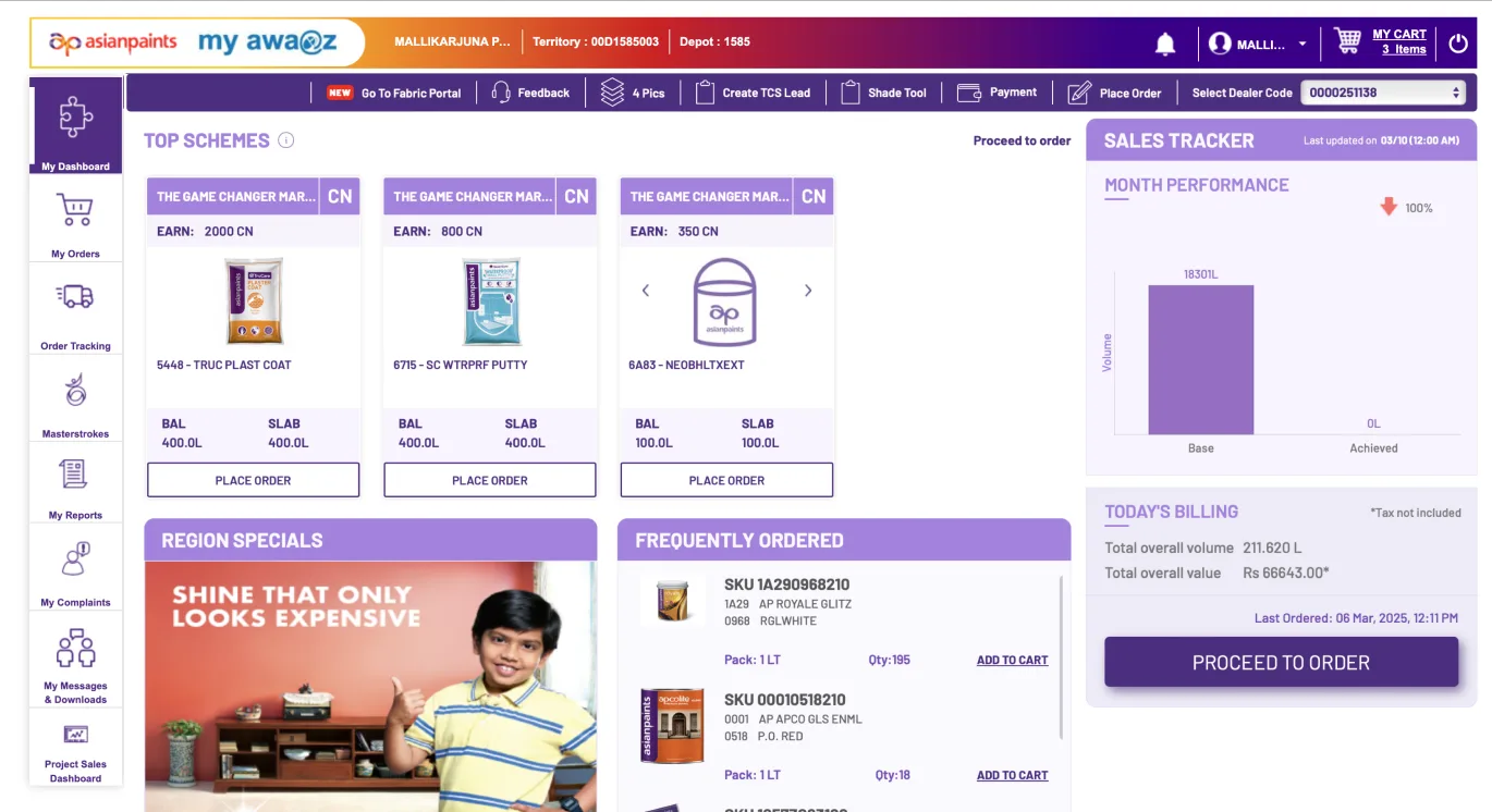
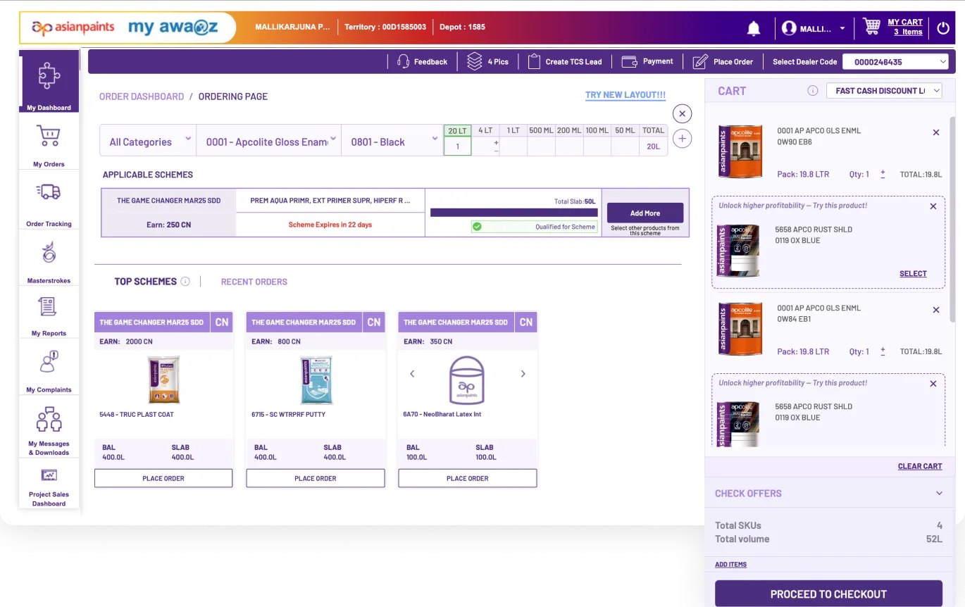
Two pathways, deliberately different: structured field interviews to watch behaviour, and a year of unfiltered feedback to hear it at scale.
Mumbai · Delhi · Bangalore · Hyderabad · Kolkata. Aged 25 – 50, medium–high tech literacy — real ordering tasks on their own accounts.
Captured across channels, with ratings out of 5★ and verbatim commentary — surfaced through in-portal feedback.
32K+ complaints, distilled to the patterns that kept repeating.
80 dealers across five cities, completing real ordering tasks.
Behaviour we saw on screen, beyond what dealers told us.
“For the same product I search again and again to add different shades. If I could select multiple shades together, ordering would be much faster.”
“In the cart, regular items and scheme items get mixed. It takes time to understand what I ordered and what got added through a scheme.”
“I want my staff to prepare the order, but final submission should stay with me. The portal doesn't clearly give that control.”
“Too much repeat work placing one order. Select product, shade, quantity — then the same thing again for another shade.”
“Schemes are not clearly separate. Normal material and offer material appear together, so final order checking becomes confusing.”
“My shop boys can do order entry, but full access feels risky. If permissions were role-wise, we could divide the work safely.”
“I don't understand why category is needed every time. I already know the product, but the portal makes me do extra steps before search.”
“Payment term is already filled, so we don't notice it sometimes. Later we realise the wrong payment term was selected, then correction becomes difficult.”
“If quantity is wrong, I get to know very late. By then I have already moved ahead. The error should show while entering the quantity itself.”
“In the cart, scheme items and normal items look almost the same. During final checking, offer material is not clearly separate.”
“My staff can make the order, but final submit should be with me only. Right now, giving access feels risky.”
“If I know the shade code, why should I first go category, product, then shade? I should be able to search directly and add.”
“Scheme added or regular item added — it is not quickly clear in cart. Everything looks mixed, so cart checking takes extra time.”
Repeated the same product-selection flow for every shade variant — even when the product stayed the same.
Skipped the category dropdown entirely and moved straight to product search.
Product discovery needed multiple sequential clicks — disproportionate for a known code.
Pre-filled payment term sat away from the decision area; dealers moved ahead without reviewing it.
Quantity errors appeared only after moving ahead — forcing a back-track that broke the rhythm.
In cart review, scheme items and regular items looked alike — extra time to tell them apart.
Relied on Tab-driven keyboard flow from Excel & Tally — the portal forced repeated mouse use.
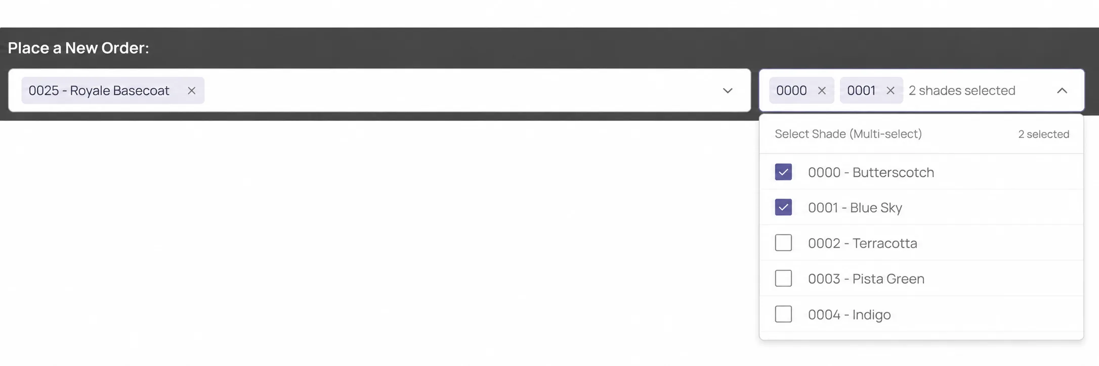
Places large project orders spanning many shades of the same product — forced through category→product→shade→quantity, then repeats. Knows codes; never uses the taxonomy.
High-volume entry; lives in Excel & Tally, moves field-to-field on Tab. The portal breaks that rhythm — wrong payment terms slip through, quantity errors surface too late.
Rajesh runs on relationships & the phone; son Aarav builds orders on the counter laptop. Defaults to a TSE call the moment the portal feels slow — the habit the revamp must replace.
Heuristics, feedback, observations and interviews — clustered into the challenges to be solved
Mismatched information architecture forcing redundant steps in product discovery.
Excessive click-path depth for standard SKU and variant selection.
Inability to bulk-add multiple product variants/shades simultaneously.
Ambiguous, unlabeled '+' icon fails to match the user's mental model for an 'Add to Cart' action.
Delayed error validation that disrupts ordering momentum late in the flow.
Unintuitive and visually disruptive 'Replace Order' modal flow.
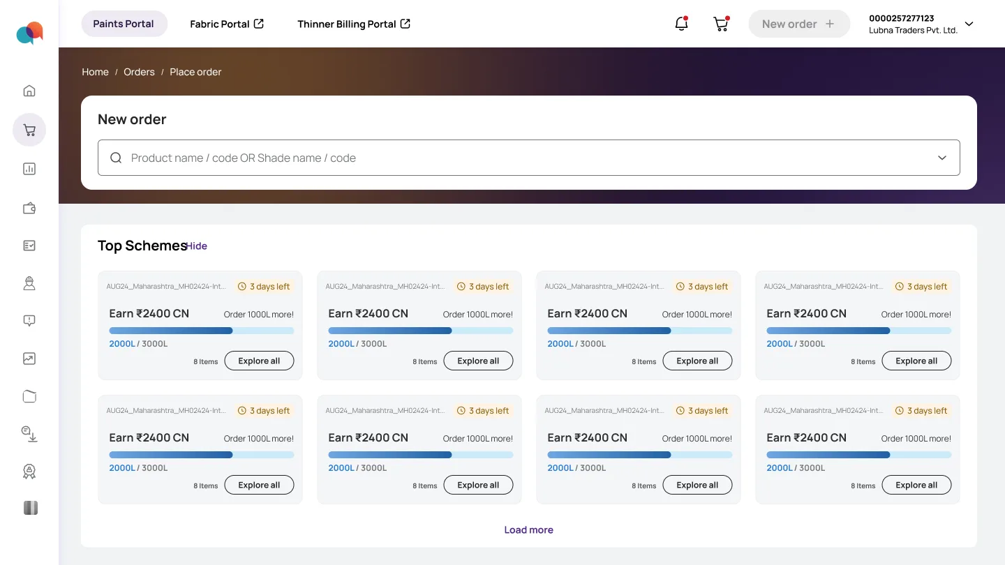
Low Discoverability of ordering entry points and lack of instant product search
Lack of keyboard-optimized navigation disrupting high-speed user flow.
Subdued visual hierarchy hiding critical ordering information and primary CTAs.
Obscured payment terms placement leading to accidental default selections.
Overcrowded cart side-panel causing high cognitive load and prolonged checkout audits.
Low discoverability of active promotions and schemes.
Poor visual separation and weak architecture for promotional schemes.
Lack of visual distinction between regular cart items and schemes creates inconsistency and visual noise.
Absence of role-based access control preventing secure task delegation.
I benchmarked the ordering journey against four competitor dealer portals — auditing user activities and content attributes across every stage to spot the features worth borrowing.
Benchmarked how portals surface system status, real-time credit, overdue ledgers and slab-target progress before ordering begins.
Compared SKU-code search, category filtering, multi-variant grid add, depot stock checks and MOQ visibility.
Audited on-list discount visibility, slab-trigger simulation, combo-bundle rules and FOC / loyalty rewards.
Looked at inline keyboard edits, order-weight vs vehicle-capacity checks and delivery scheduling.
Full competitive feature-coverage matrix is a work in progress — shown here as the dimensions audited & the opportunities they surfaced.
Four clusters, untangled together — because fixing search, cart and schemes in isolation kept breaking each other.
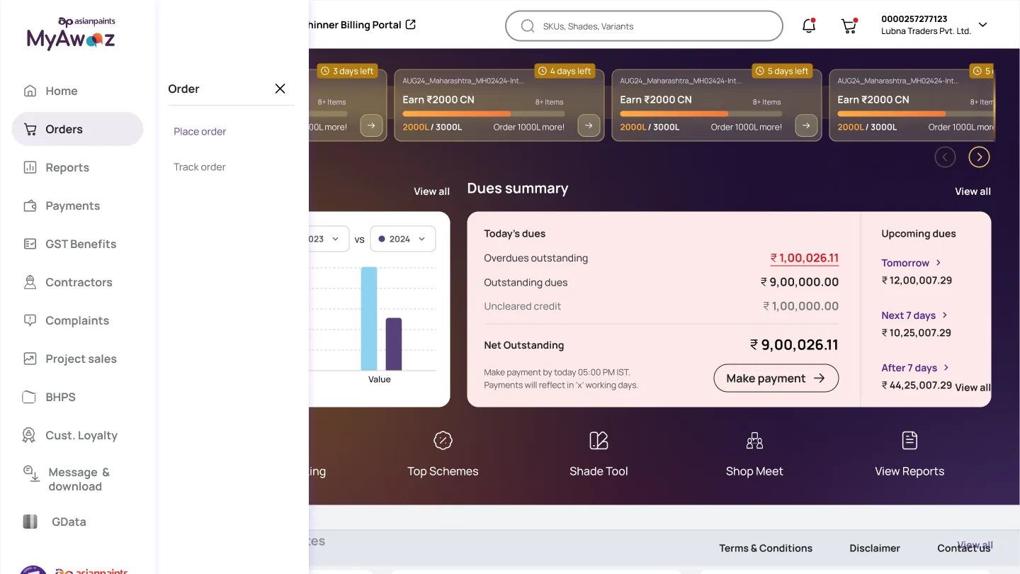
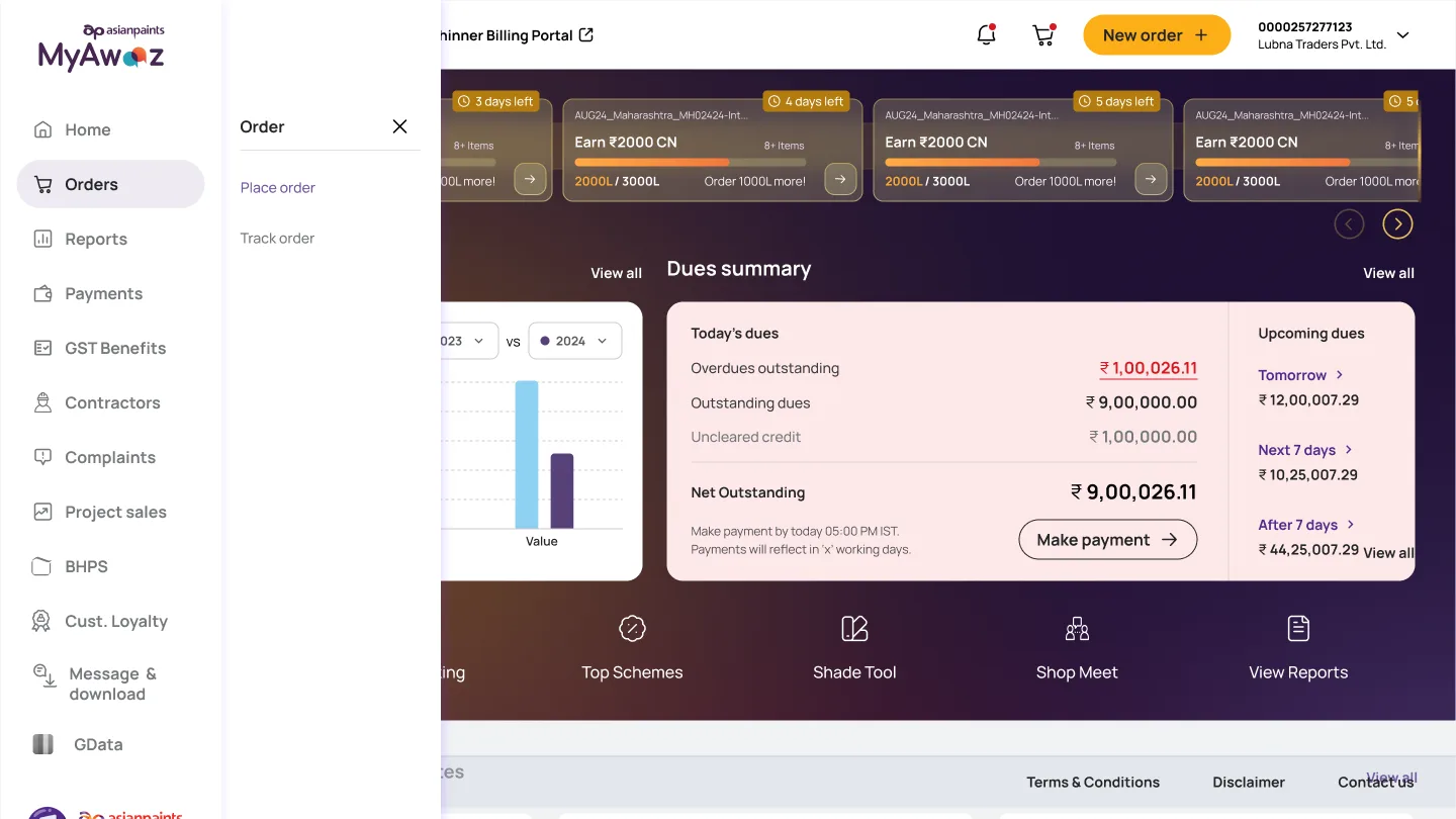
Going back to the CTA option — but a much more prominent one.
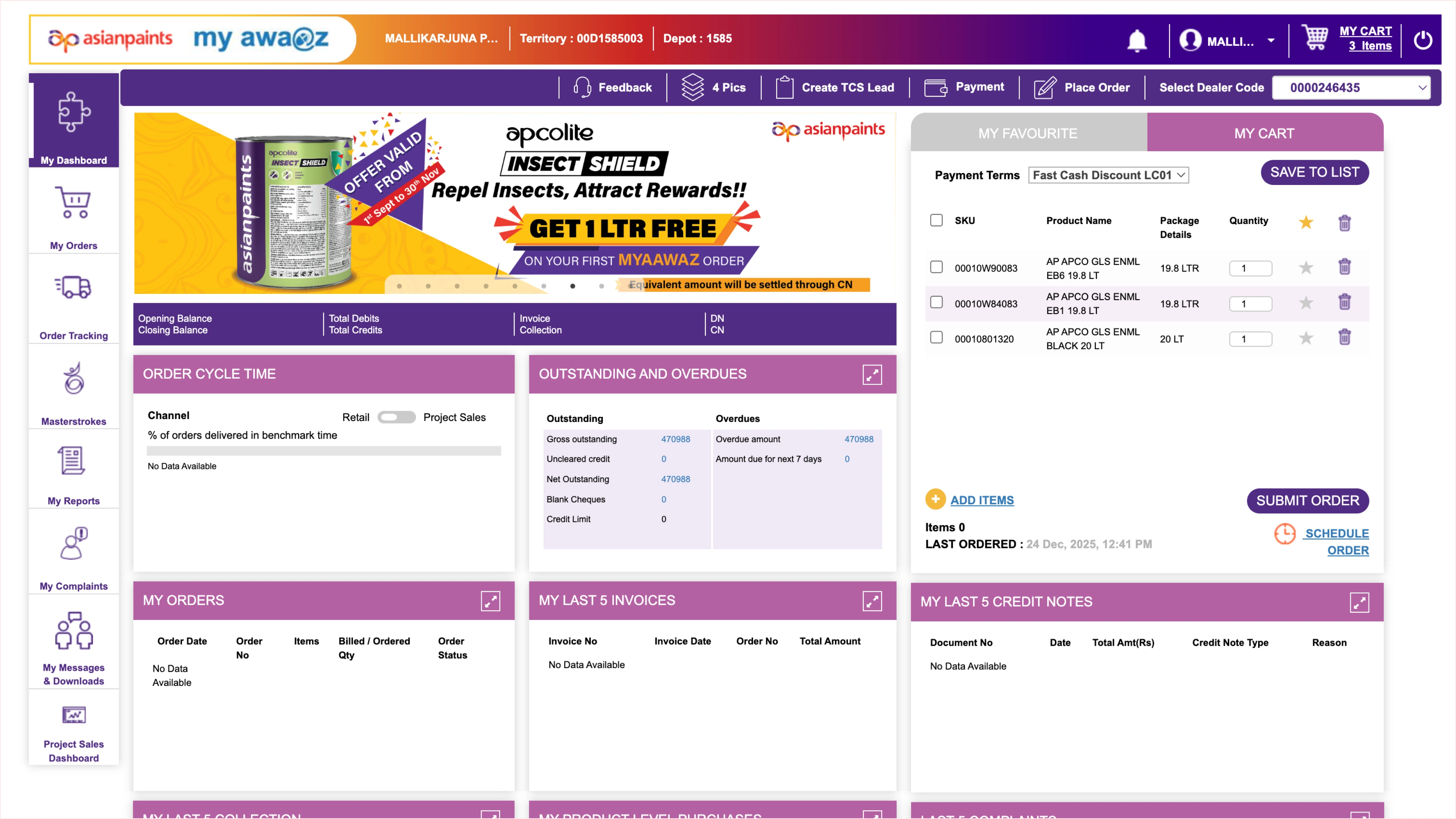
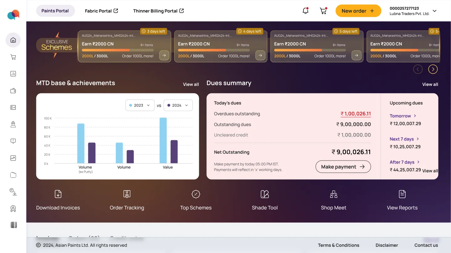
Here, problems couldn't be solved in silos. It was a revamp of the flow, so the layout had to be imagined considering all the elements together.
These foundational decisions — and their pros & cons — were mapped in the 'Major Layout Decisions' tab of the Affinity Mapping sheet. They shape the design calls across Clusters B, C & D. Once the layout was finalised, the cluster-level explorations below follow.
Fewer visible steps and a familiar flow — the dealer reviews added items on the same page.
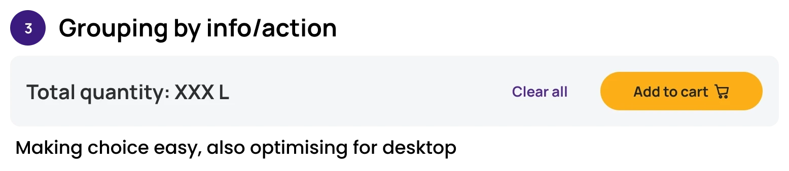
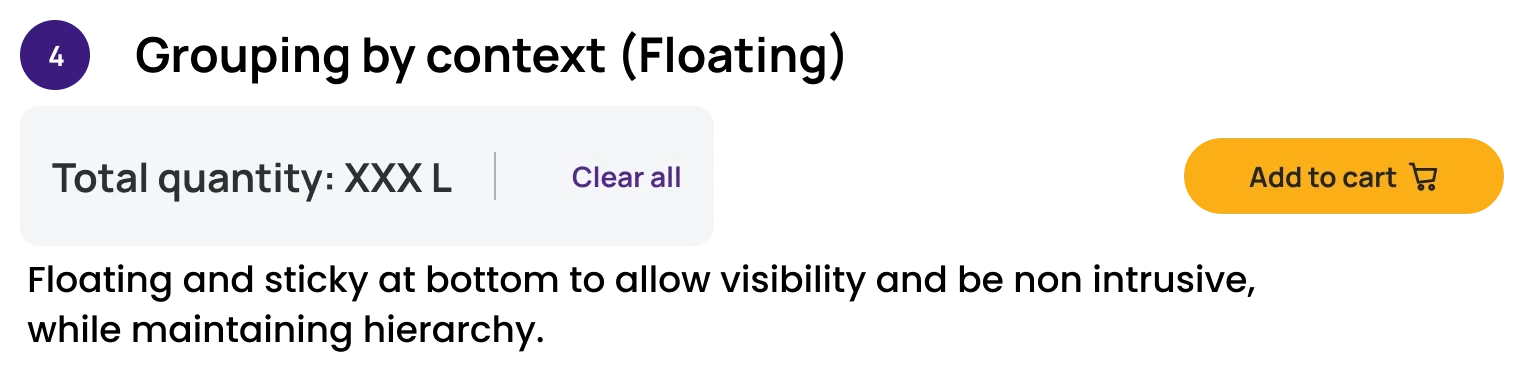
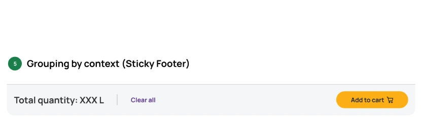
Balanced both needs — the cart shouldn't consume permanent space, but should stay quickly accessible without moving to the next step.
Build the order, then review it — two distinct tasks, two distinct moments.
The cart was removed from the item-selection page not to hide it, but to protect the dealer's primary task — finding products, entering quantities, and evaluating schemes without distraction.
Simple, linear and easy to implement — everything stacked top to bottom.
The right hierarchy — search initiates, quantity dominates the workspace, schemes stay visible alongside.
Keep the main task central. Keep decision support visible, but secondary.
Dealers weren't browsing — they were searching with intent, in bulk. The flow had to match that.
The flow assumed that dealers were browsing. In fact, they were searching with intent.
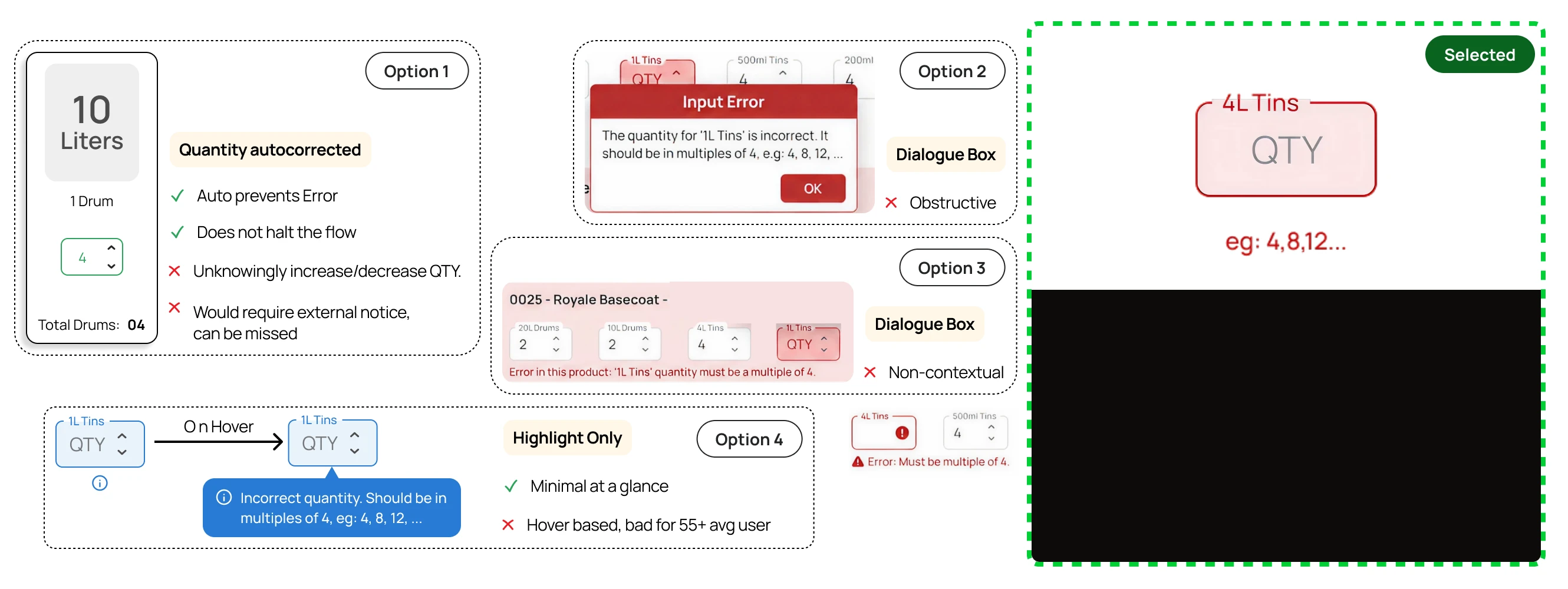
Key Tension: the original layout had volume-only labels — more prone to quantity-entry errors. Design assumption: some SKUs ship only in fixed-count cartons (4 / 8 / 12 tins) and can't be sold loose — so spelling that out on the label, and switching the input from a count of tins to a count of cartons, would cut errors and speed bulk ordering.
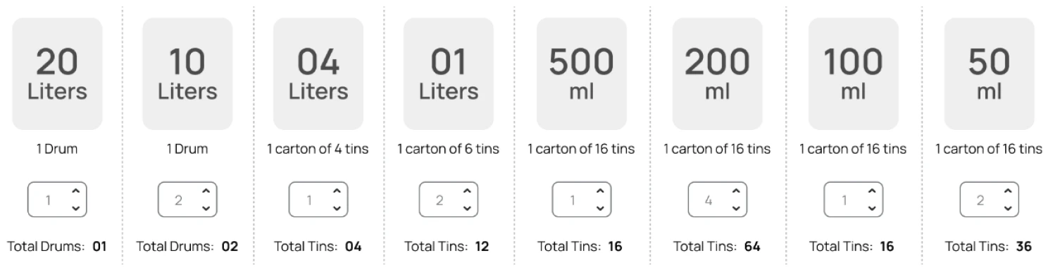
The label was accurate, but interaction-wise it created doubt — entering 1 means what? 1 carton? 1 tin? 4 tins? It explained the packaging system instead of simply guiding quantity entry.

Key Opportunity: compact, operational input fields could do more than prevent errors — being easy to stack in a grid, they opened the door to a true bulk-ordering flow and made keyboard-driven entry even faster.
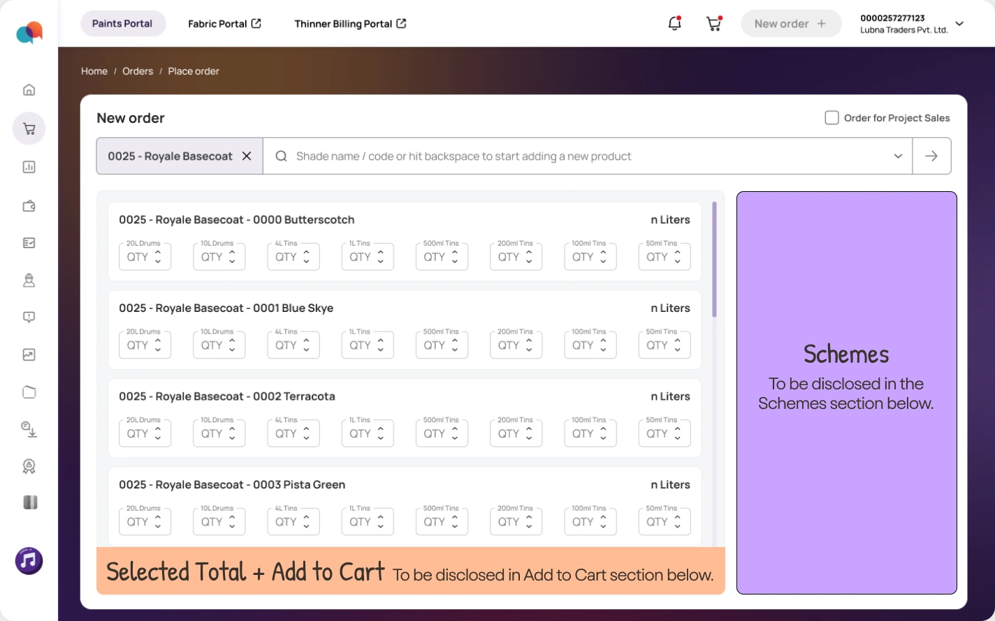
The default label identifies the input — the system explains constraints only when dealers need them, as error states & helper texts.
A pending unfulfilled SKU means a new order replaces it. The old modal screamed red — as if blocked. The new one is blue: "you can proceed, but this replaces something." Tied to the exact SKU, with an explicit next action, scaling to multiple pending SKUs.
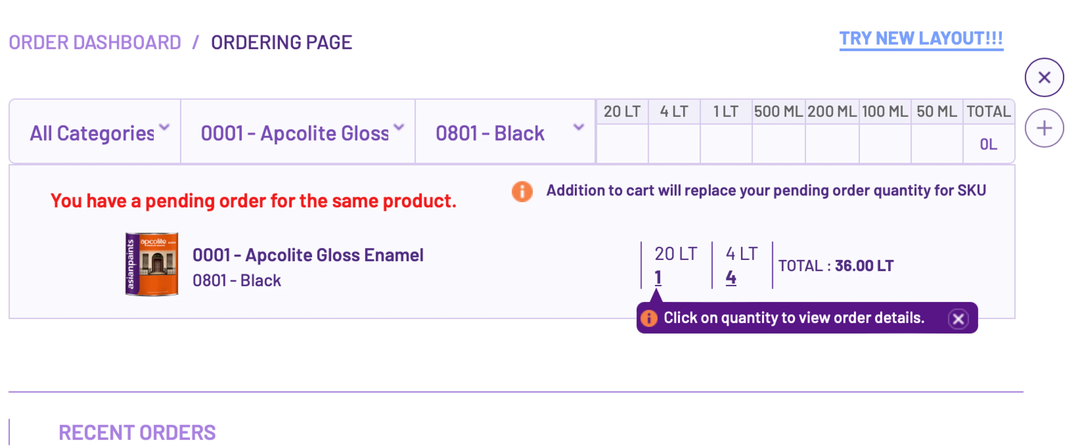
The exception: a dealer cannot place an order for a specific SKU of a specific shade if there's already a pending/unfulfilled order for the same — the new order replaces the pending one.
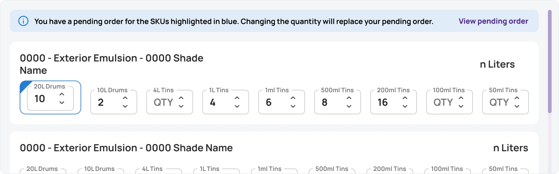
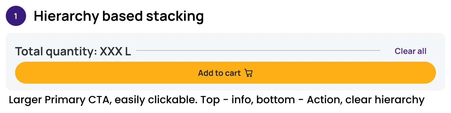
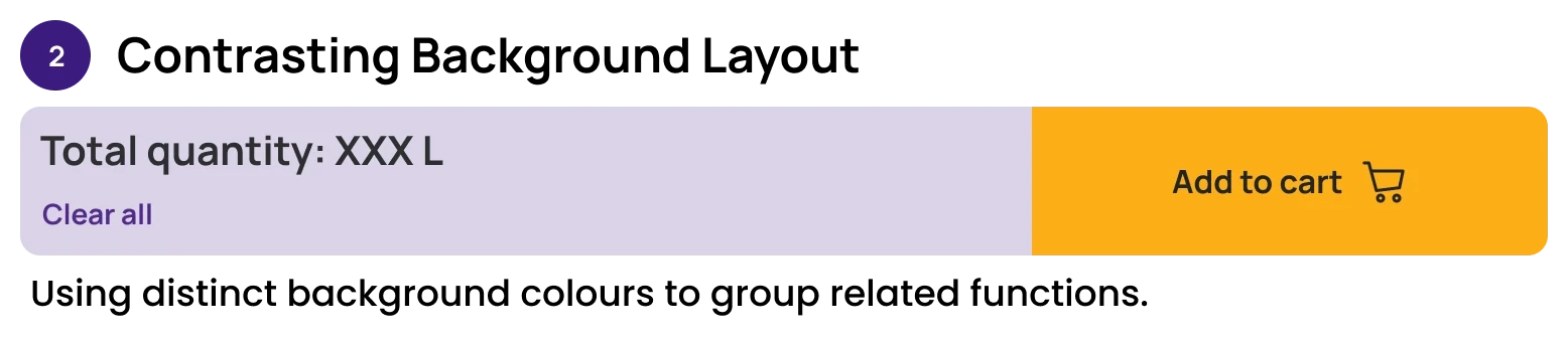
This complete reimagining of the search & item-selection process also solved for keyboard optimization.
With the cart given a page of its own, the cluster came down to two decisions — settle these and the rest of checkout falls into place.
Key constraints: the search page must stay fast and focused, and the cart summary must stay visible to the user during the search process.
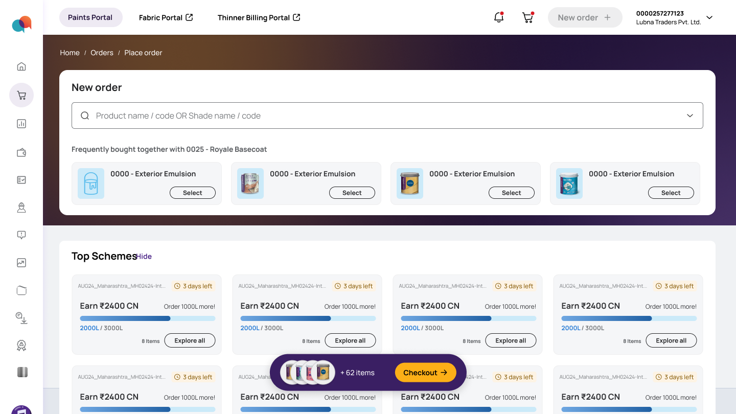
Schemes can be availed in either step — add-items and cart — so their position has to stay identical on both pages to keep the experience consistent. That fixed the skeleton; the two sections below are built inside it.
Pinned to the top of the layout: order impact and the checkout actions read before anything needs scrolling. Cleaner layout for easier review, familiar UI for editing.
The sidewise positioning of the schemes section improves the discoverability by a lot and also solves for the visual adjacency. What remains is to solve the information hierarchy & layout of the schemes card.
Mobile wasn't a copy of desktop — dealers use the app for quick, smaller orders. Research here was lighter and app-specific, anchored in Playstore reviews (2.9★) and on-app observation.
Key design decision: a single, thumb-reachable “Place order” entry on the app home — replacing the buried menu path — so dealers can begin an order the moment they open the app.
Key design decision: product and shade selection broken into two separate steps and entities — reducing clutter and increasing clarity on the small screen.
Key design decision: accordions for quantity input, bucketed by shade, create distinct visual segregation — enhancing clarity, accelerating steps and minimising cognitive load while handling large amounts of information.
Key design decision: the cart review was intentionally compressed. Since dealers usually place smaller orders on mobile, the design prioritises order summary and checkout decisions upfront — keeping detailed SKU review accessible through expandable shade-wise accordions.
Role-based permissions so staff can prepare an order while the owner keeps final submit — ~45% of feedback.
Repeat or import past orders, and export clean records for audit.
"6 drums of Royale Basecoat, Butterscotch and Blue Sky" — and AI assembles the basket.